Introduction
In 2021, Wix faced an internal challenge: the creation of back-office applications had become fragmented and inconsistent across different product teams. As Wix rapidly expanded, this issue grew, leading to inefficiencies and slower response times to user needs. Our goal with Wix Patterns was to streamline these processes, ensuring developers could focus on business logic while maintaining high-quality, consistent user experiences. As the UX Lead for Wix Patterns, I played a central role in shaping the product solution and building a dedicated team to address this issue.
The Challange
Wix’s growth came with a downside—each product team was creating unique UX patterns for their specific needs. This led to a disjointed user experience, with no standardization across the company’s various back-office platforms. Teams were spending significant time and effort redeveloping UX components, leading to duplication of work, increased bugs, and an inconsistent experience for users.
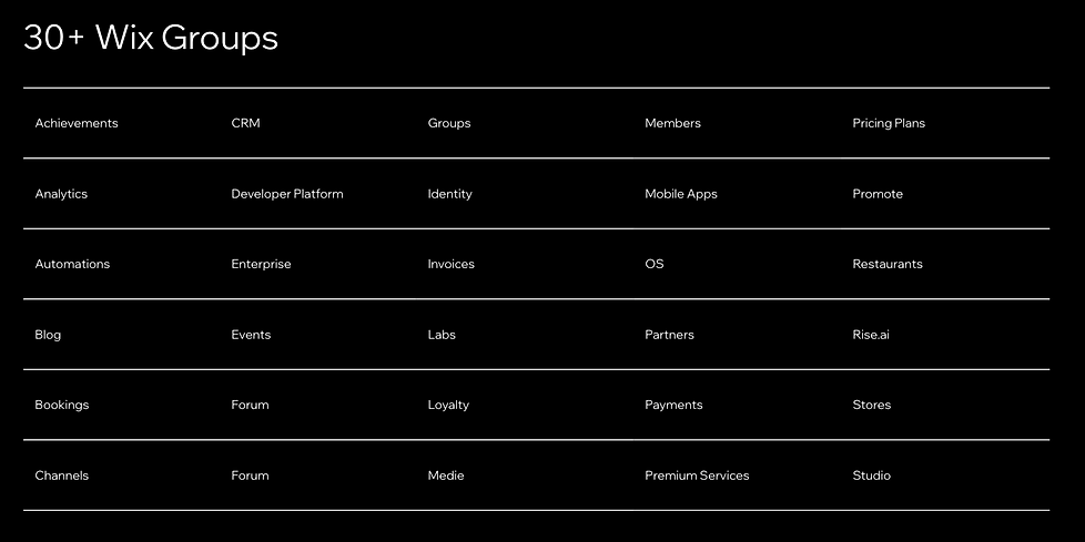
By 2021, the situation had become untenable. With more than 30 different product groups developing UX solutions independently, we faced a huge variation in back-office designs. In particular, table components—used for data management across the Business Manager platform—were a significant pain point. There were 274 tables spread across different applications, and creating each one from scratch took anywhere from 3 to 6 months.

In each product group, UX teams work on specific products. They are doing specific research based on the business needs and user needs and therefore making unique product solutions for those segments.
Research and Analysis
Our first step was a thorough analysis of the back-office platform. We found numerous inconsistencies, especially in navigation, with different pages either having or lacking breadcrumbs, back buttons, and other essential UX elements. Tables, however, were the most problematic. They were ubiquitous across applications, yet each one was built differently, adding unnecessary complexity and inefficiencies.
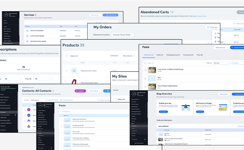
Research our own back-office UX Patterns
To get a better understanding, we conducted interviews with group leaders, product managers, UX designers, and other stakeholders. It became clear that developing a comprehensive, functional table with necessary tools like search, bulk actions, and export features was an extremely time-consuming process. We also looked at competitors to evaluate the solutions they were using for similar data management tools.

Data managment features research
Envisioning the Future: How I Conceptualized the Soultion
We decided to form a dedicated task force consisting of UX designers, developers, product managers, and data analysts. Our objective was clear: to develop a platformized solution that could deliver consistent, high-quality UX components that could be integrated across different Wix products.
We began by mapping out all the critical features required for the table component. We created a Storybook library, which provided developers, product teams, and UX designers with a comprehensive set of pre-approved tools. This allowed teams to quickly integrate these components without needing to reinvent the wheel each time.
In parallel, we also developed a new Figma library for the 200+ UX designers at Wix, simplifying the process for them to build new products using our standardized components.
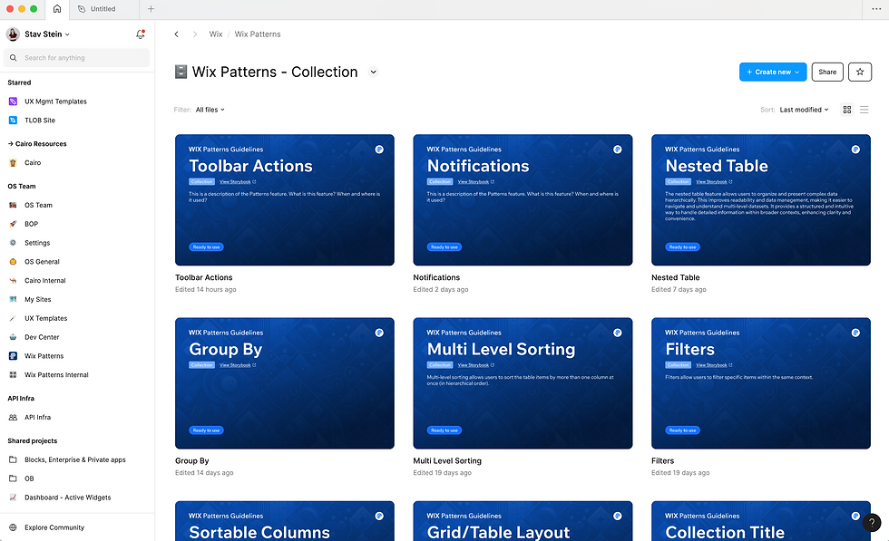
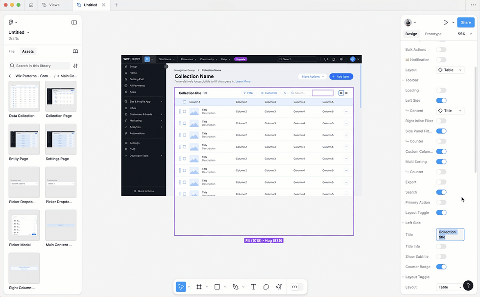
Advanced Patterns Figma Library
Collaborating with Teams: How I Fostered Cross-Functional Partnerships
Our first major test came when the Wix Bookings team partnered with us to revamp their back-office Services page. The old page, built with Angular, was riddled with performance issues and was slow, especially for users managing more than 200 services. This was an opportunity not just to test our new table component, but also our team’s methodology and workflows.
However, we faced a challenge: the Wix Bookings team expected us to replicate the exact functionality of the old page, including drag-and-drop capabilities for rearranging services. Due to time constraints, we couldn’t prioritize this feature for the first release. We had to balance our partners’ needs with practical development limitations, and this was our first experience navigating such external pressures.
To address the immediate needs, we developed a temporary solution using a modal for reordering services, while our UX team worked on designing the drag-and-drop feature for future implementation.

Old Bookings Services Page
Overcoming Challenges: My Solutions to Obstacles Faced During Development
To validate our solution, we created a prototype and conducted usability tests with five users. The results were promising—while most users instinctively tried to drag and drop the services, they quickly adapted to the new modal interface. All users were able to complete the required tasks, confirming that our solution was effective.
This initial success set the stage for rapid development. The Wix Bookings team started integrating the new table component just a day after our kickoff meeting, and within a month, they had conducted their own usability testing to validate the new experience.
Usability test
Usability test


The new Booking's Services page
Results and KPIs
Our solution delivered measurable improvements, especially in terms of performance and user engagement. We saw reductions in support tickets related to service reordering and significant time savings in product development.
Key performance indicators included:
-
Improved page performance
-
Faster service creation.
-
Enhanced engagement with key features such as editing, deleting, and duplicating. services.
Reflecting on the Journey: My Insights and Lessons Learned
Our experience with Wix Bookings demonstrated the value of our platformized approach. We learned the importance of flexibility in accommodating external requests and sticking to our vision of creating consistent, high-quality UX patterns across Wix’s back-office applications.
Moving forward, we are focused on continuously refining and expanding Wix Patterns. We've established a dedicated product team, and our standardized components are now integrated into all new and updated products. In addition to the core table components, we've added more features like picker modals, popovers, and setting pages, further enhancing functionality. We're also excited to release our state management library to external developers, giving them access to our smart JS patterns to build back-office applications more efficiently.
This project has laid the foundation for future innovations, and I’m particularly proud of the strong team we’ve built as part of WixOS. Together, we will continue to push the boundaries of what’s possible for back-office UX at Wix.
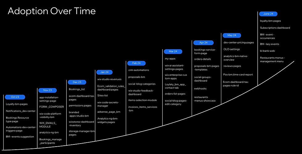
Wix Patterns Adoption Over time
Developing a New Quality Methodology
The failure of the Quality Blitz approach led me to realize that we needed a custom methodology that better suited our group's needs, especially given our reliance on other platforms and our central role in Wix's broader efforts. Here's how we turned things around:


